
The Io project in 24 seconds
Read the video summary
The video introduces Io, Jupiter’s volcanic moon, and maps 266 hotspot records from the Juno/JIRAM catalogue. It explains the aim of comparing geology, testing across regions and making uncertainty visible. Coverage bias and a synthetic tidal proxy limit the analysis. This is exploratory research, with no confirmed new discoveries. The project uses Python, Streamlit and spatial analysis with AI-assisted development. Surface imagery is credited to NASA in the video.
The problem
Explore how observed volcanic hotspots relate to surface geology and candidate tidal-heating features, using open planetary datasets.
The approach
The repository brings together data ingestion, grid alignment, exploratory maps and a Streamlit dashboard. A scientific analysis layer examines geological enrichment, coverage bias, sensitivity and spatial cross-validation.
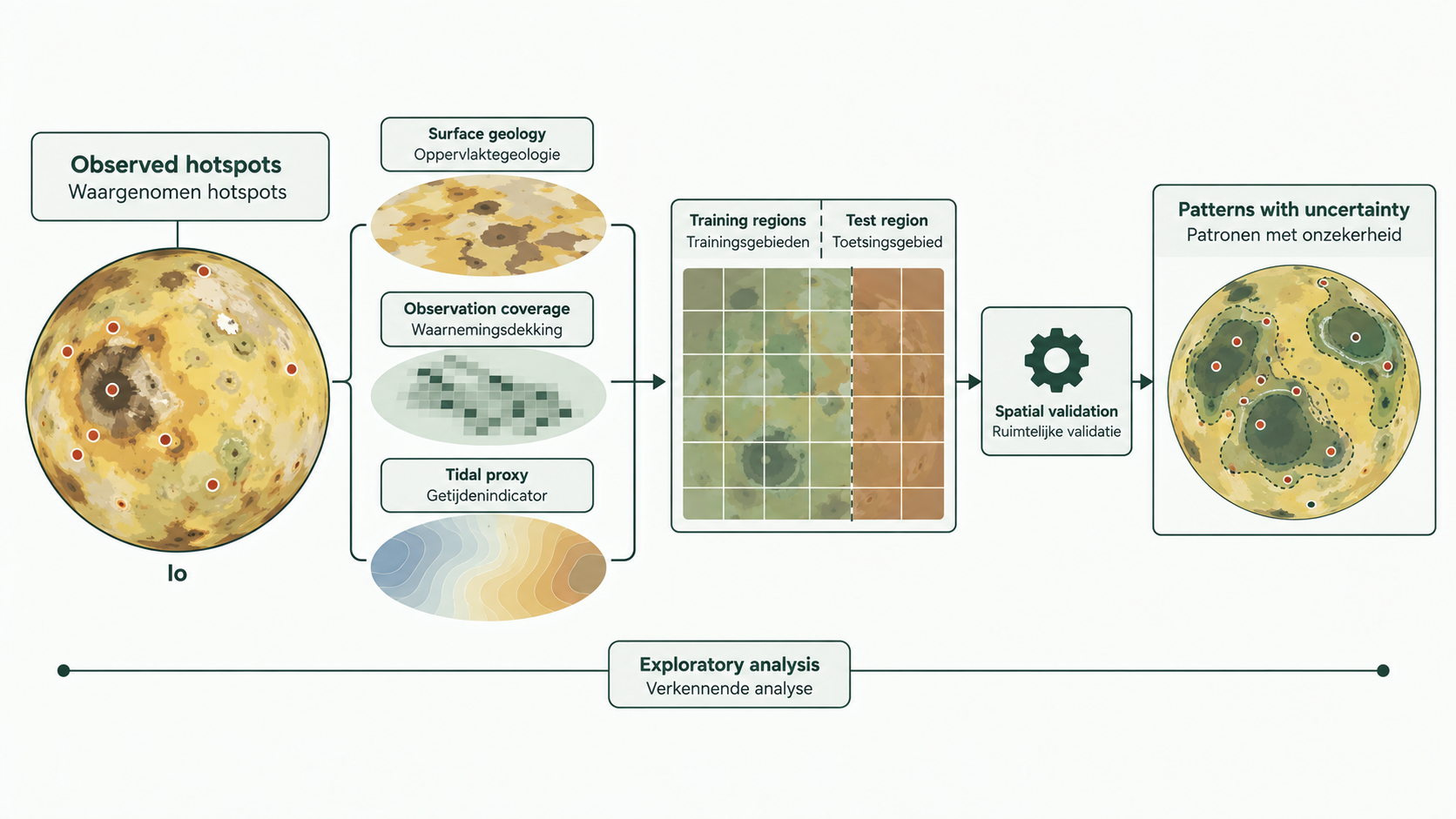
Text description of the infographic
The project aligns hotspot records and analytical layers on a common grid, then uses separate regions for training and testing. Geology, observation coverage and a tidal proxy are considered alongside uncertainty. The maps and dots in this infographic are illustrative, not measured positions or validated model output.
The challenge
Some features can encode the answer. The repository explicitly identifies a distance-to-hotspot leakage problem and distinguishes an analytical tidal proxy from a physical model. Interpolated maps are not presented as new observations.
Outcome & value
An inspectable research and teaching tool, with assumptions and known limitations documented alongside the code. It does not claim to discover new volcanoes or establish a validated forecasting system.
Lessons learned
Documenting assumptions and limitations makes the work easier to assess and develop further.
Evidence & artifacts
- WEBOpen the Io dashboard
Interactive project dashboard hosted on Render.
- CODE